Grupo Emtel_
Brand Manual, Logo/
2021
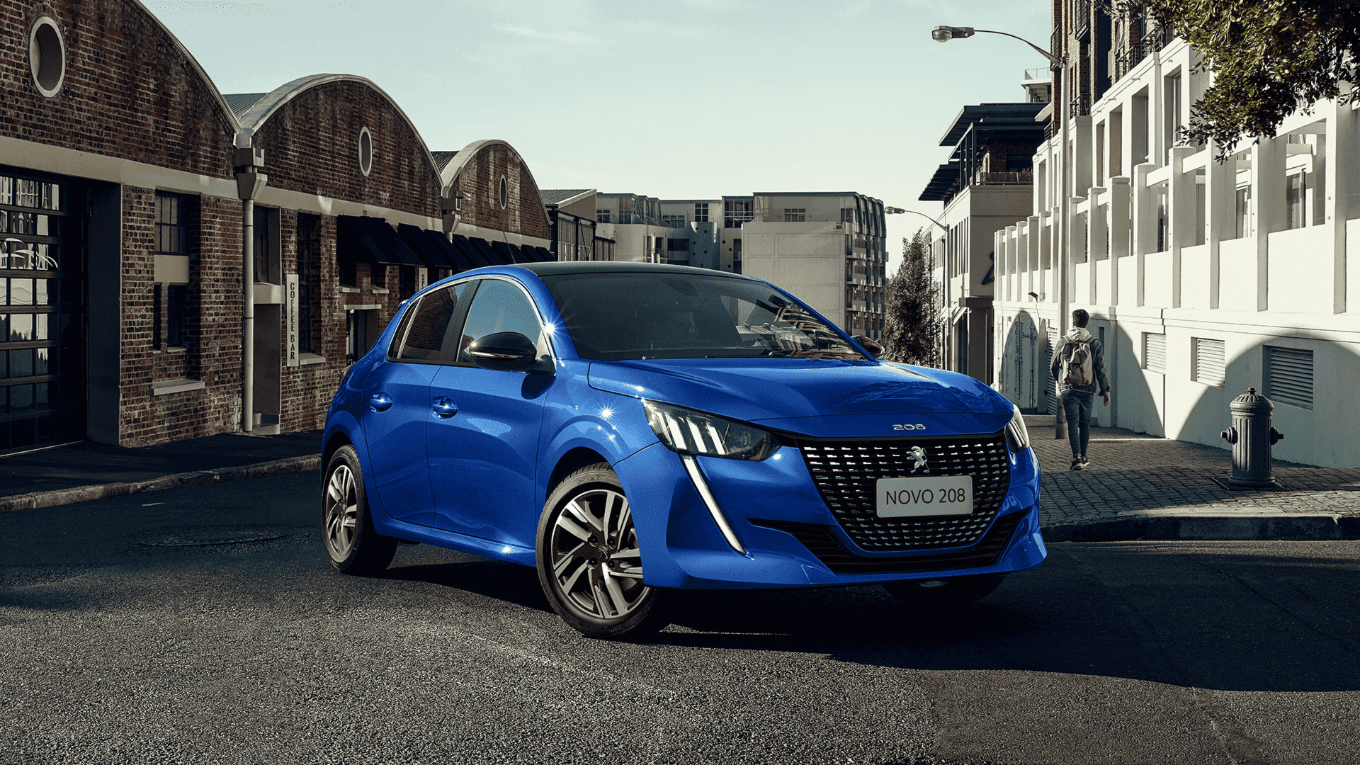
Triasa Group is a prominent group of vehicle dealerships specializing in various brands. With multiple locations across the country (Brazil), Triasa aims to unify its brand identity and enhance its market visibility through a logo redesign. The existing logo, while recognizable, lacks coherence and fails to convey the group’s collective strength and expertise.
Brand Designer
2/3 months
Photoshop
Sketch
Figma
Modernization
The previous logo design appeared outdated and did not reflect Triasa’s commitment to innovation and cutting-edge automotive solutions.
Brand unity
The redesigned logo needed to reflect the group’s collective identity while allowing individual dealerships to maintain their unique brand identities.
Approach
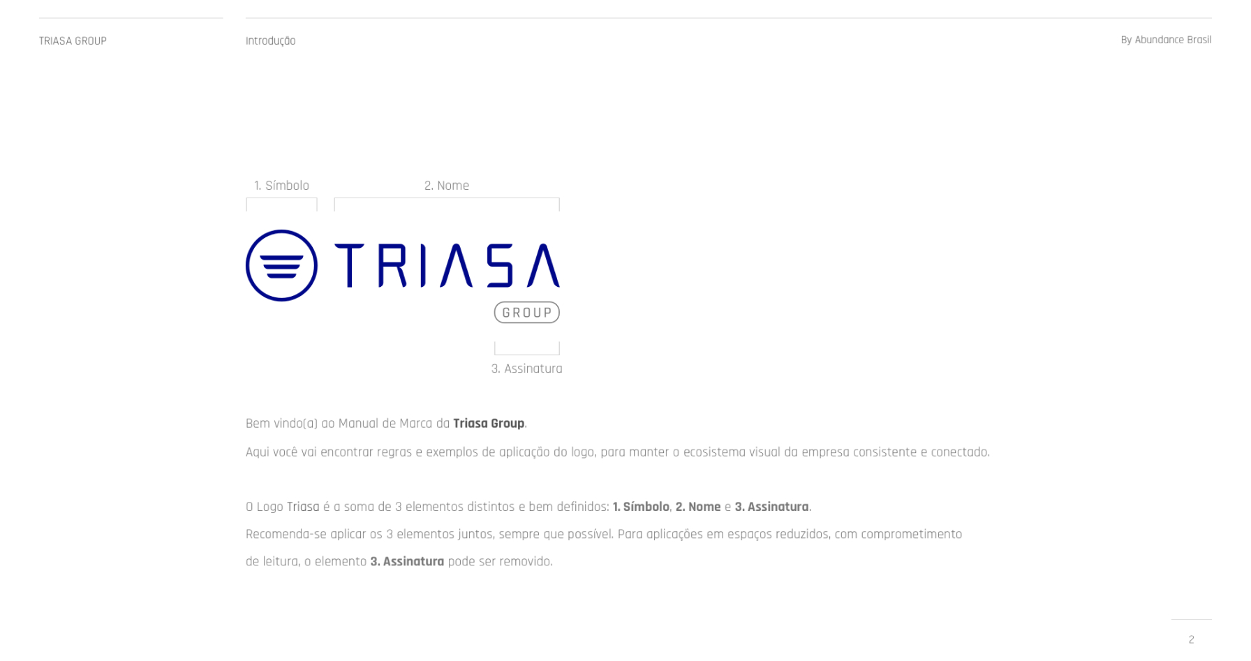
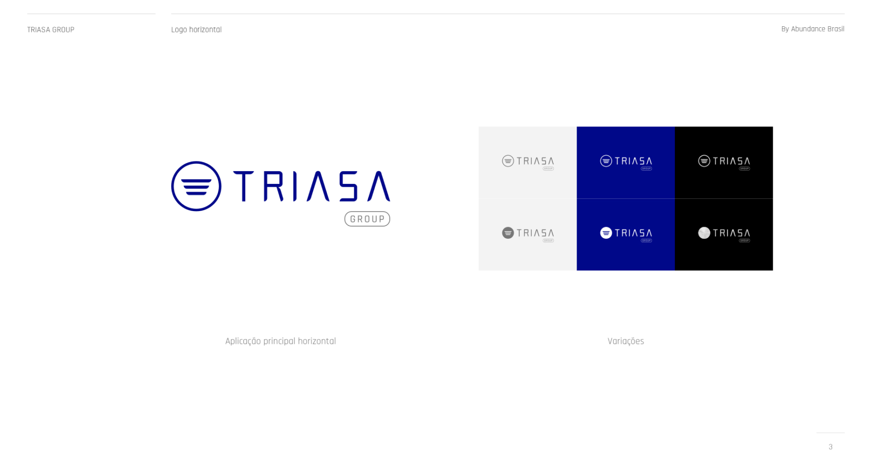
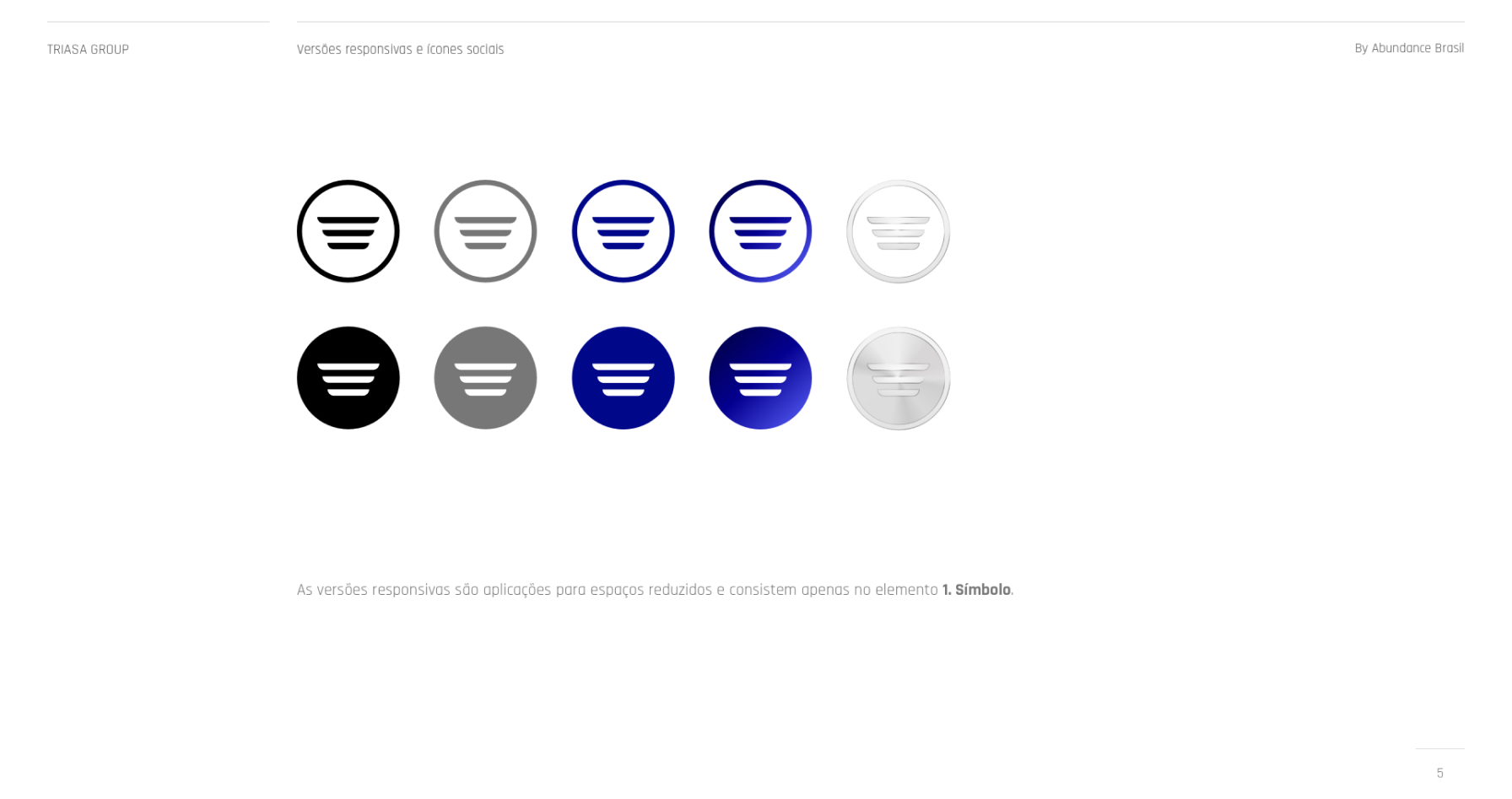
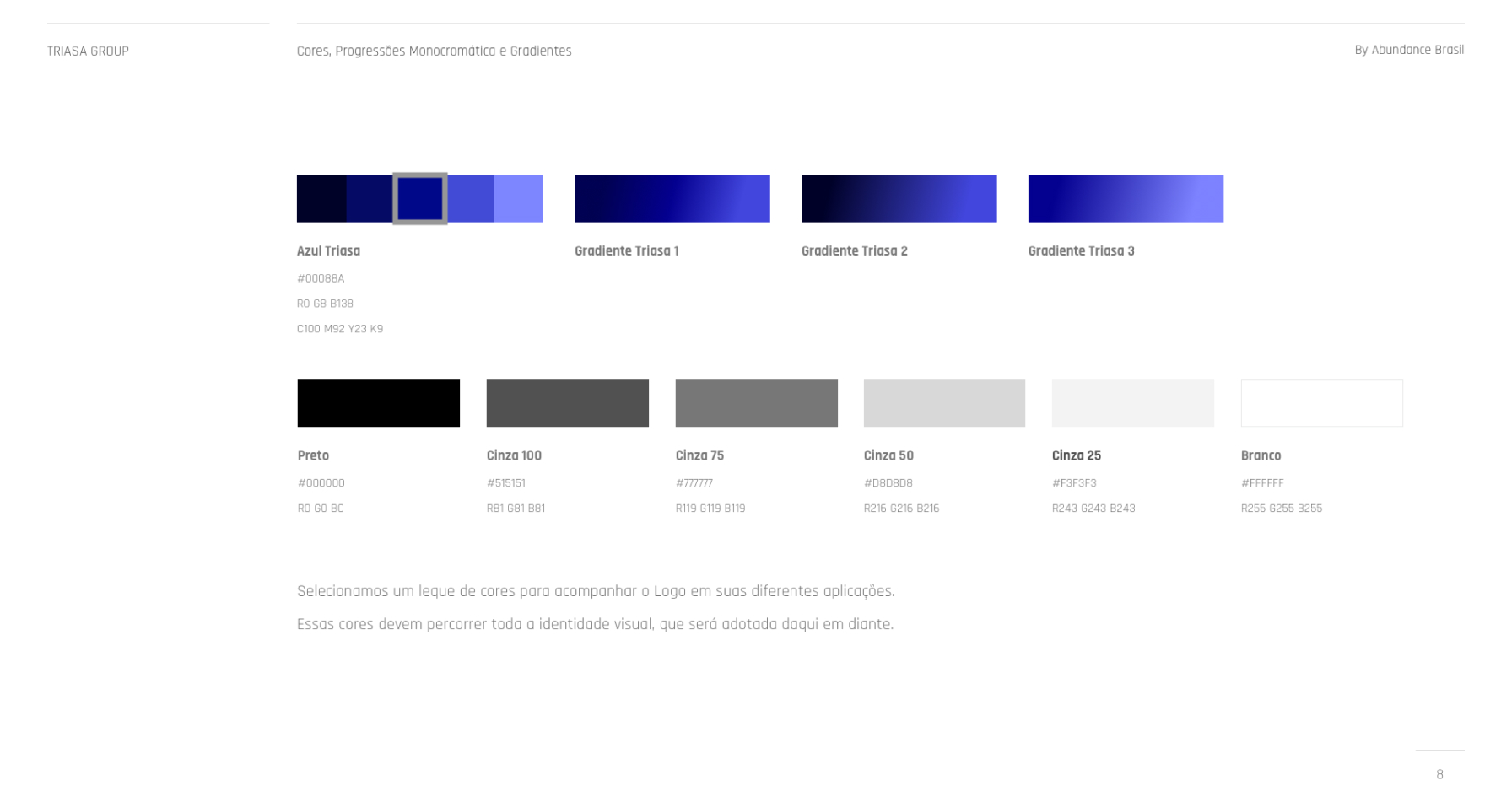
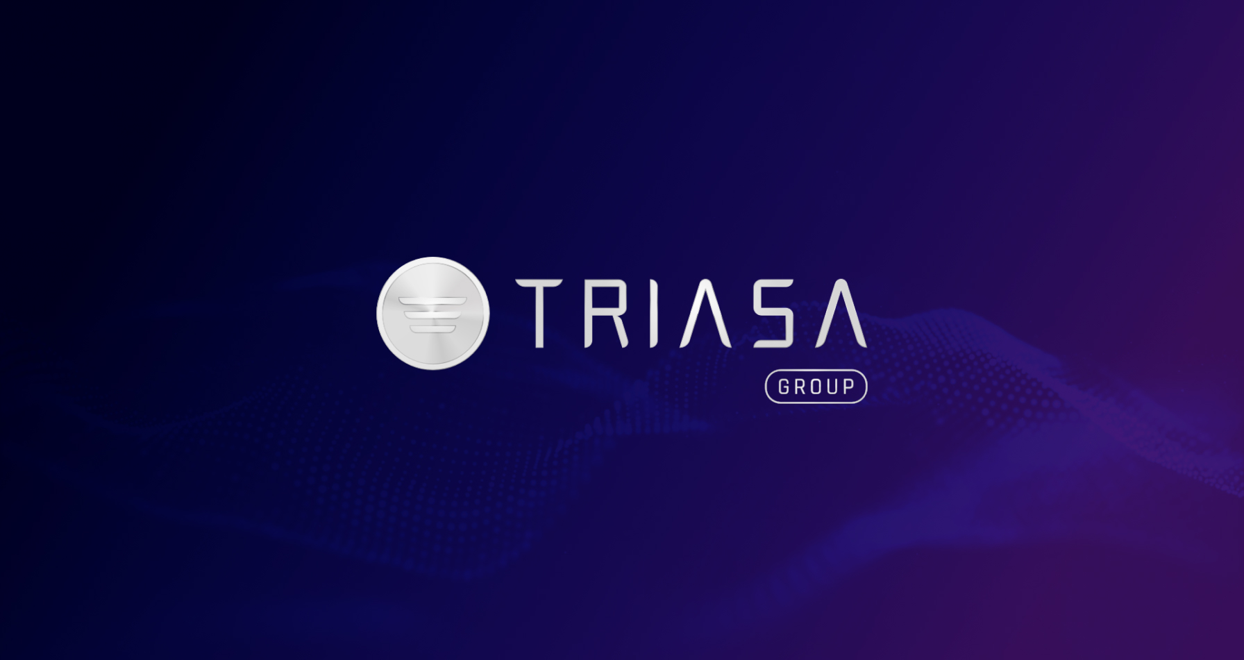
After extensive collaboration and iteration, the chosen logo design featured a sleek and dynamic emblem that represented Triasa’s collective strength and expertise. The emblem consisted of three wings, symbolizing collaboration and synergy among the group’s dealerships. The typography was bold and modern, conveying a sense of confidence and professionalism. The color palette included shades of blue and silver, reflecting trust, reliability, and innovation.
The redesigned logo successfully revitalized Triasa’s brand identity, garnering positive feedback from stakeholders and customers alike. The unified logo design fostered a sense of cohesion and consistency across the group’s dealerships, strengthening brand recognition and recall. The modern and dynamic visual identity positioned Triasa Group as a forward-thinking leader in the automotive industry, attracting new customers and driving business growth. Overall, the logo redesign reinforced Triasa’s commitment to excellence and set the stage for continued success in the competitive automotive market.


Marcos Loureiro © Selected works from 2010-2024 — Belo Horizonte - BR
