marcosloureiro1980@gmail.com

Tragaluz

Grupo Emtel_

Brand Manual, Logo/

2021

Tragaluz is a non-profit social project from Grupo Emtel dedicated to providing housing solutions for impoverished families in need. The project aims to offer safe and dignified living spaces to those facing housing insecurity, empowering them to build better futures for themselves and their communities.

Project

Role

Brand Designer

Period

3 months

Tools

Photoshop
Sketch

Challenges

  1. Brand identity: Tragaluz needed to establish a clear and cohesive brand identity that reflected its mission, values, and impact.
  2. Consistency: With various stakeholders involved in the project, ensuring consistency in branding across all communication channels was essential.
  3. Clarity: Providing guidelines for the appropriate use of the logo and branding elements helped maintain the integrity and recognition of the Tragaluz brand.

Approach

  1. Brand assessment: Conducted research to understand Tragaluz’s mission, values, target audience, and desired brand image.
  2. Stakeholder engagement: Collaborated with project leaders, volunteers, and community members to gather insights and input on the brand identity.
  3. Creative exploration: Brainstormed logo concepts and branding elements that evoked feelings of hope, stability, and community.
  4. Design iterations: Developed multiple logo prototypes and branding materials, experimenting with colors, typography, and imagery.
  5. Feedback gathering: Presented the proposed designs to stakeholders for feedback and incorporated their input to refine the final logo and branding.
  6. Creation of branding manual: Developed a comprehensive branding manual that outlined guidelines for logo usage, color schemes, typography, and brand messaging.
  7. Training and implementation: Provided training sessions for staff, volunteers, and partners on how to use the branding manual effectively.

Solution

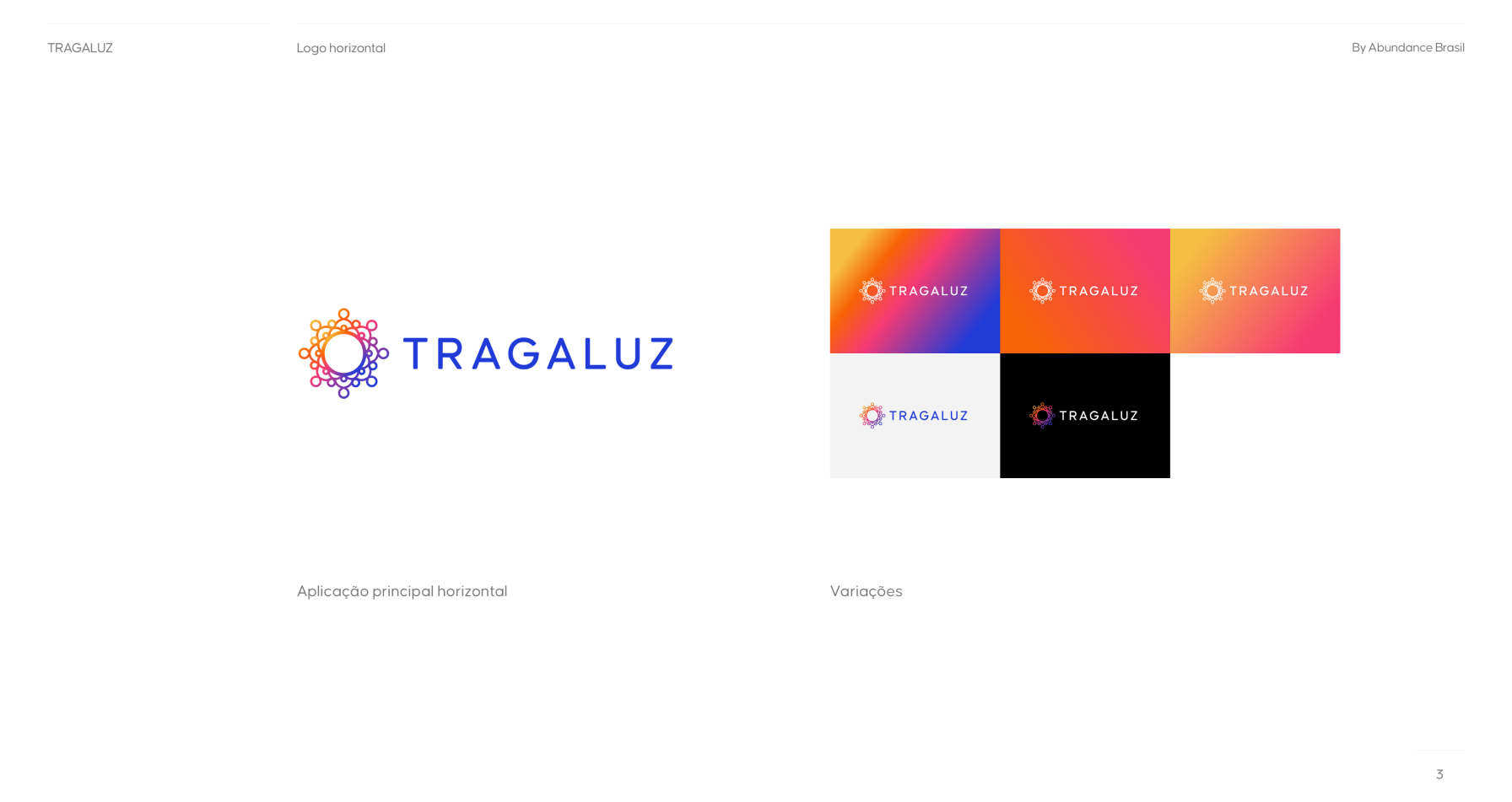
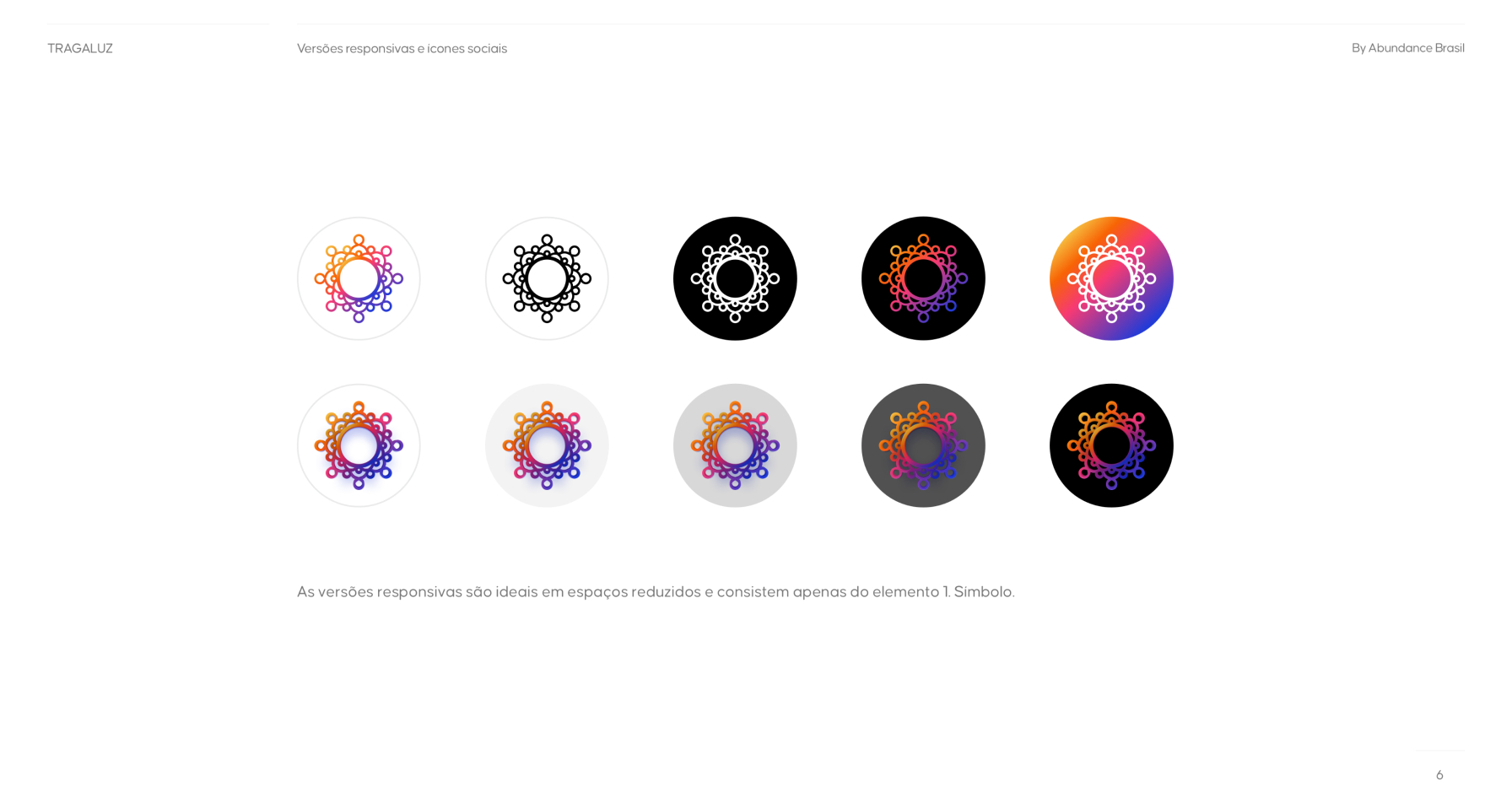
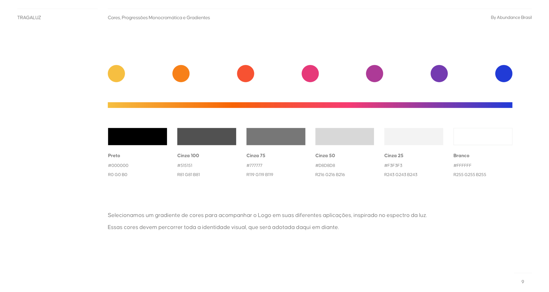
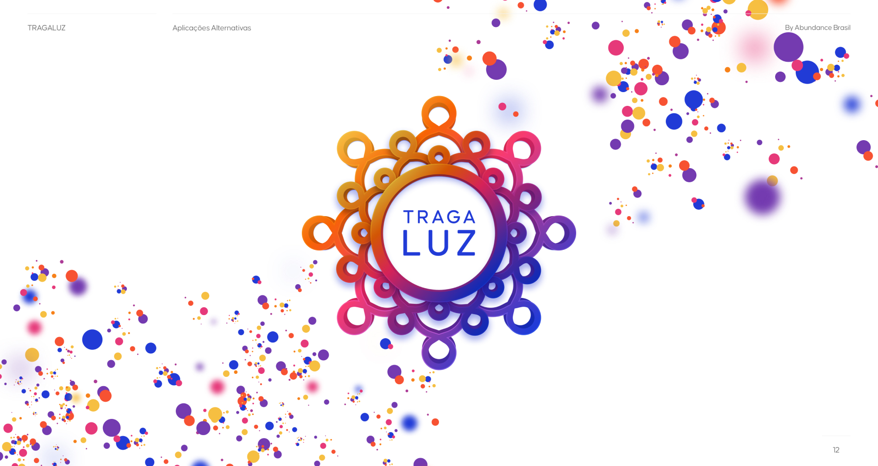
The finished Tragaluz logo featured a stylized representation of a group of people generating light. The typography was clean and modern, with the name “Tragaluz” written in an easy-to-read font. The color palette included warm tones like orange and yellow, conveying feelings of warmth, positivity, and optimism, alongside blue tones to complement the spectrum.

Results

The branding and logo manual for Tragaluz provided a cohesive and impactful visual identity that effectively communicated the project’s mission and values. By adhering to the guidelines outlined in the manual, Tragaluz ensured consistency in branding across all communication channels, enhancing brand recognition and credibility. The clear and comprehensive guidelines empowered stakeholders to effectively use the Tragaluz brand to support its mission of providing hope and shelter to underprivileged families. Overall, the successful branding and logo manual contributed to Tragaluz’s efforts to make a positive and lasting impact on communities in need.