marcosloureiro1980@gmail.com

Rebranding

CDC Card_

Brand Manual, Rebranding/

2021

CDC is a reputable credit card company based in Brazil. Despite its long-standing presence, it recognizes the need to revamp its brand identity to stay relevant in an increasingly competitive financial landscape. The existing logo and branding feel outdated and fail to convey the company’s commitment to innovation, security, and customer-centricity.

Project

Role

Brand Designer

Period

2/3 months

Tools

Photoshop
Sketch

Challenges

  1. Outdated branding: The current logo and branding lacked modernity and failed to resonate with tech-savvy consumers.
  2. Brand perception: CDC aimed to position itself as a leader in financial innovation and digital banking, but its current branding did not reflect this image.
  3. Market competition: With the rise of fintech startups and digital banks, CDC faced stiff competition and needed a refreshed brand identity to stand out.

Approach

  1. Brand assessment: An in-depth analysis of CDC’s brand values, target audience, and market positioning was conducted to identify areas for improvement.
  2. Market research: Insights were gathered from existing customers, industry experts, and market trends to understand evolving consumer preferences and expectations.
  3. Competitive analysis: The branding strategies of competitors in the financial services sector were evaluated to identify opportunities for differentiation.
  4. Creative exploration: Concepts were brainstormed that captured CDC’s core values of innovation, trustworthiness, and accessibility.
  5. Design iterations: Multiple logo and branding concepts were developed, experimenting with typography, color palettes, and visual elements to create a cohesive and memorable brand identity.
  6. Feedback gathering: The proposed designs were presented to a diverse group of stakeholders, including employees, customers, and industry experts, to gather feedback and insights.
  7. Refinement: Feedback was incorporated to refine the chosen logo and branding elements, ensuring they aligned with CDC’s brand vision and resonated with its target audience.
  8. Implementation plan: A phased rollout plan was developed to implement the redesigned logo and branding across all touchpoints, including marketing materials, digital platforms, and physical cards.

Solution

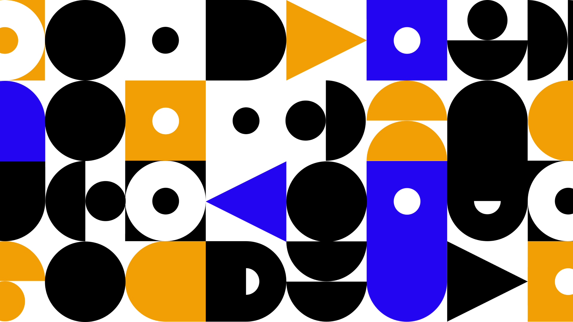
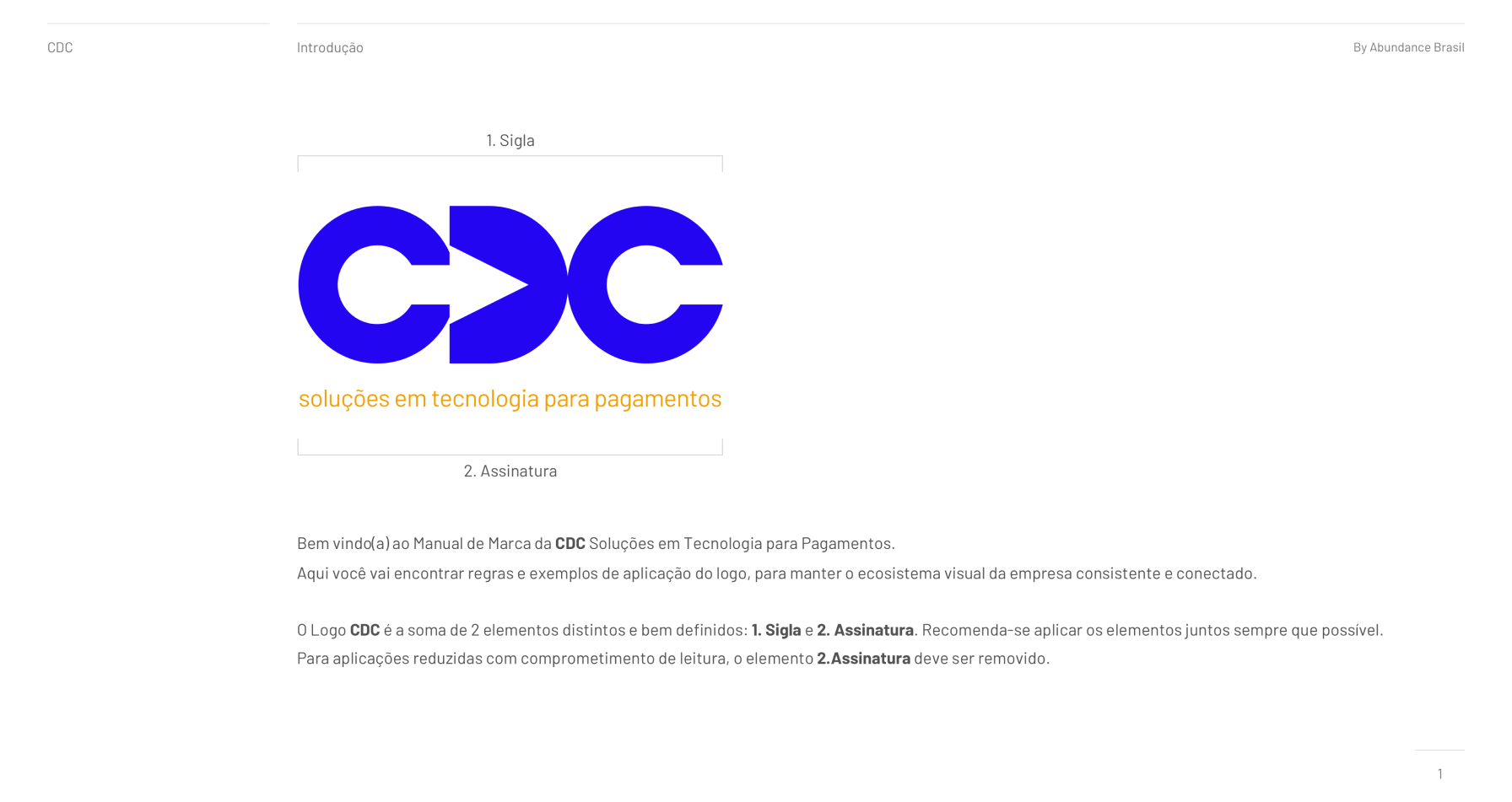
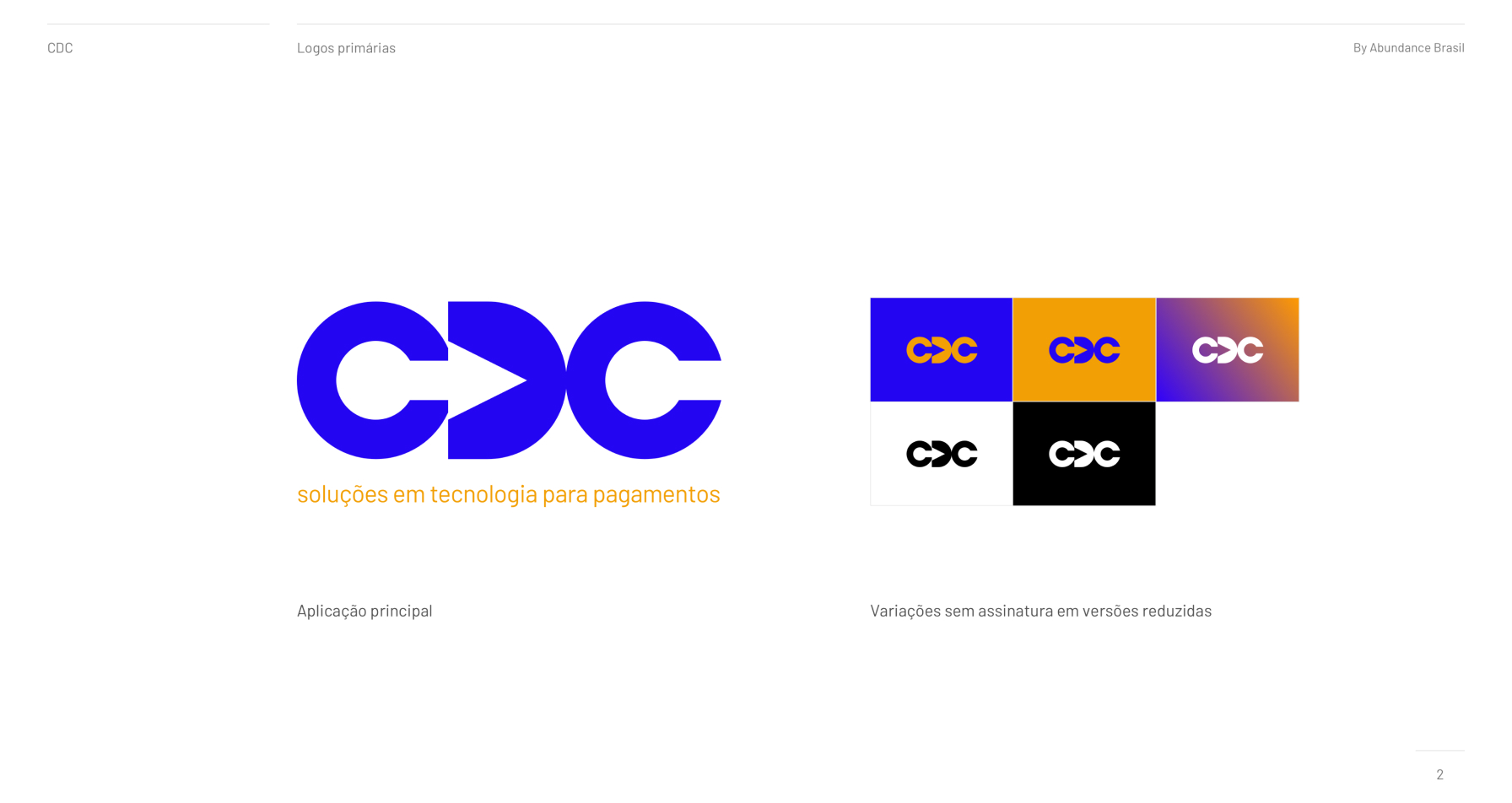
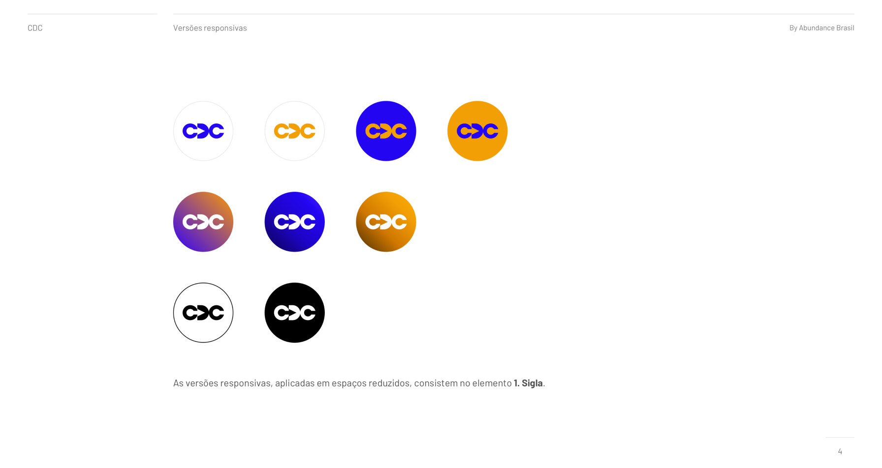
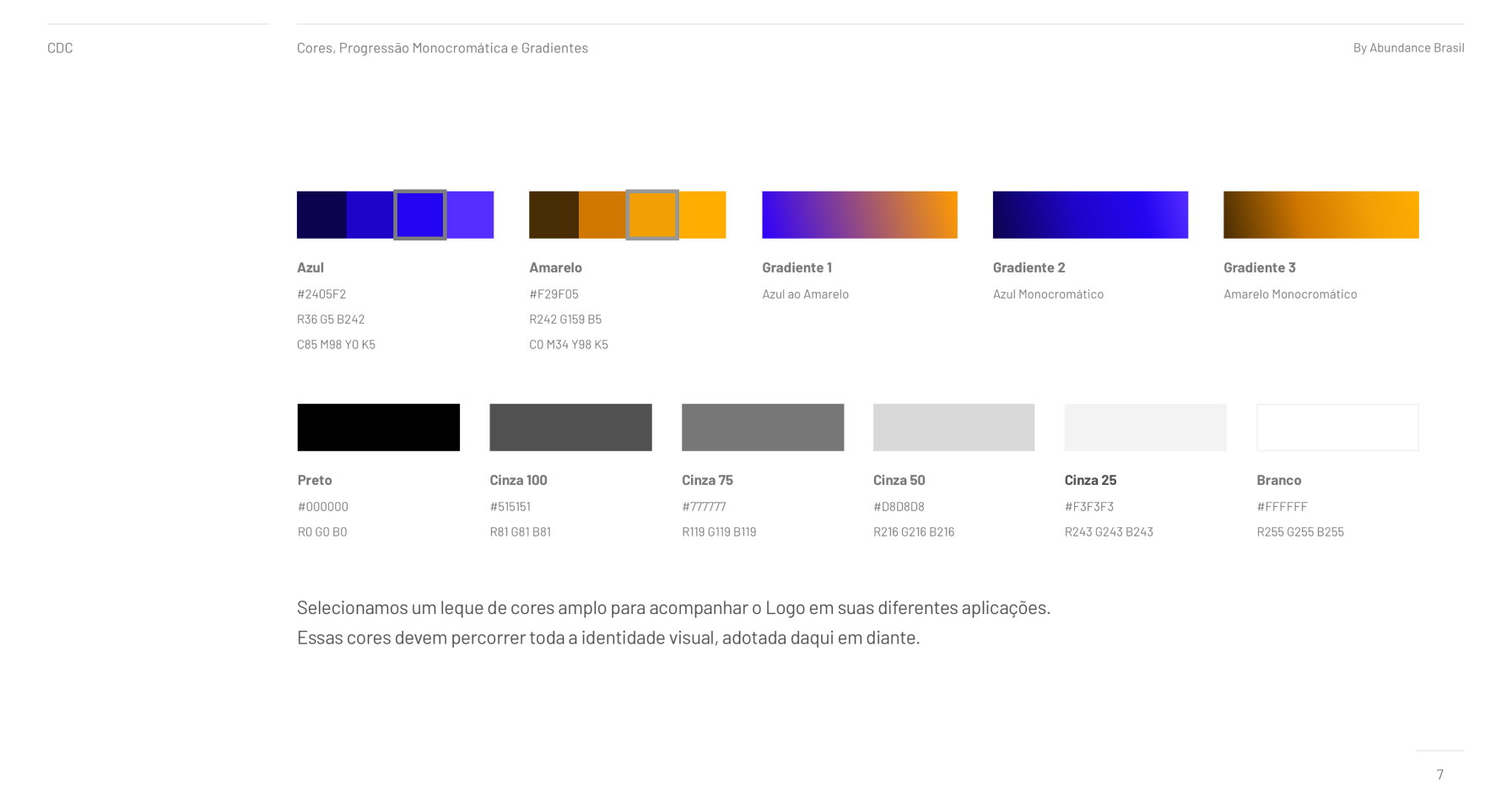
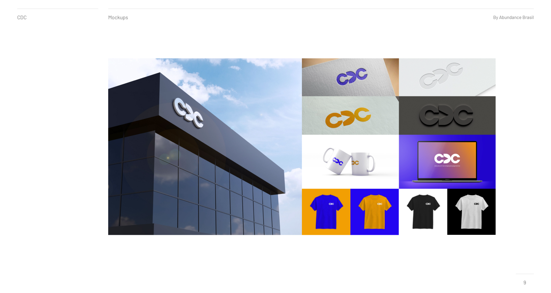
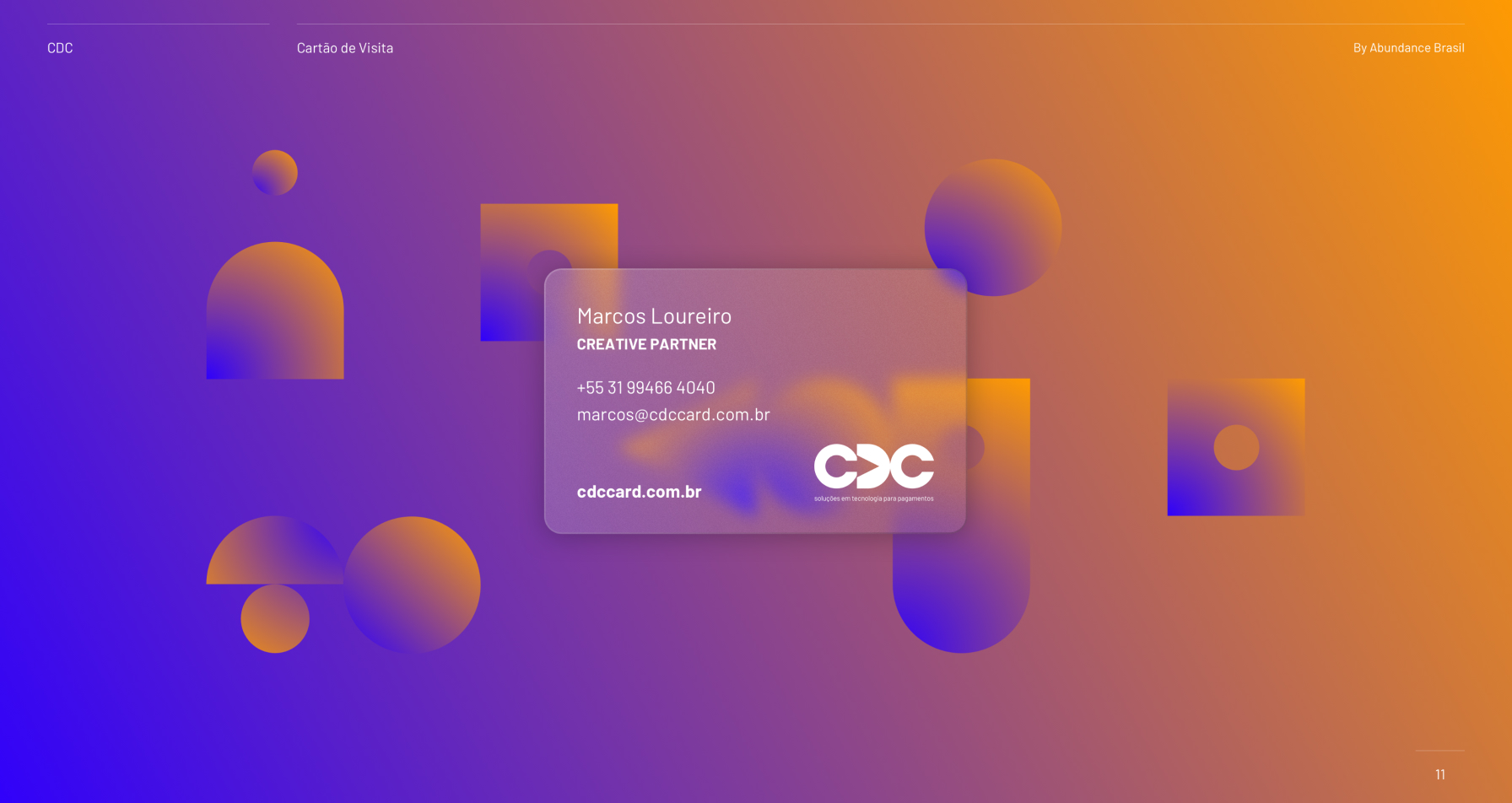
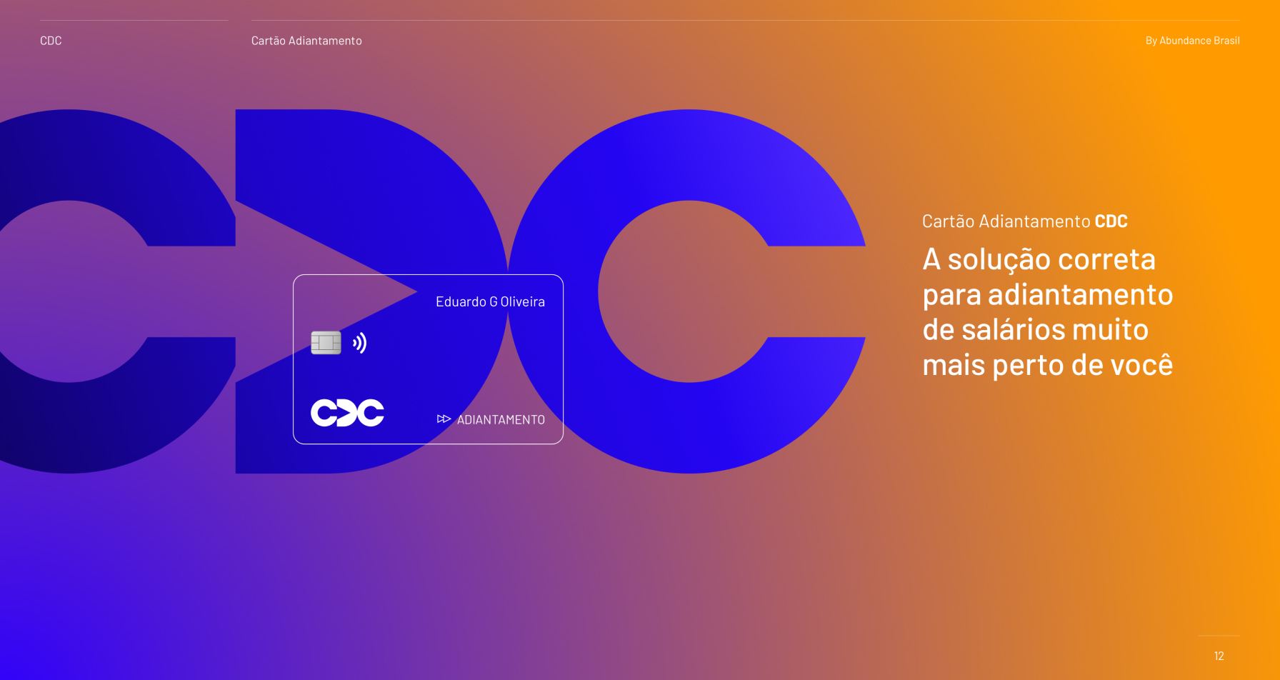
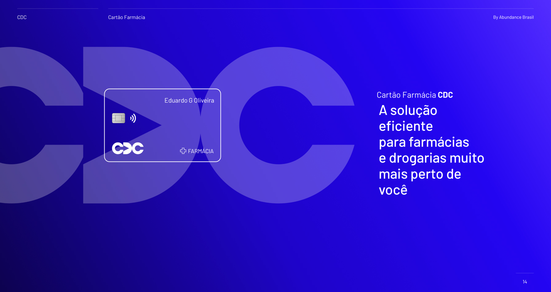
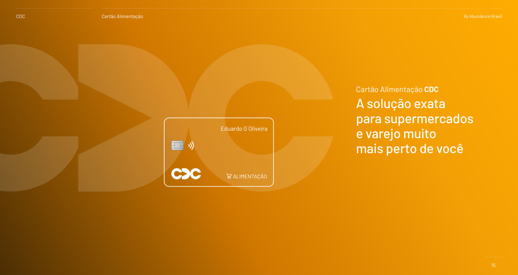
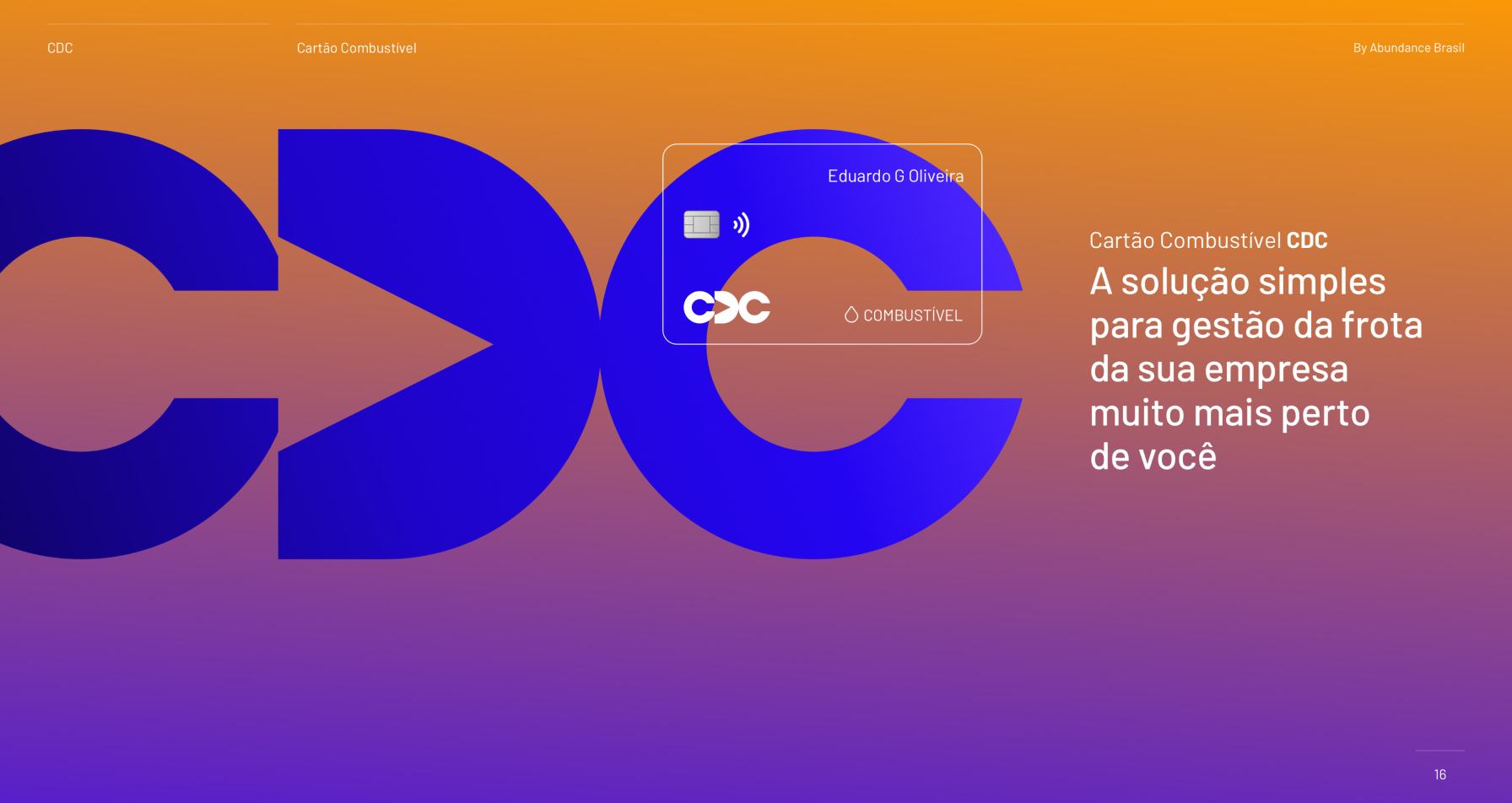
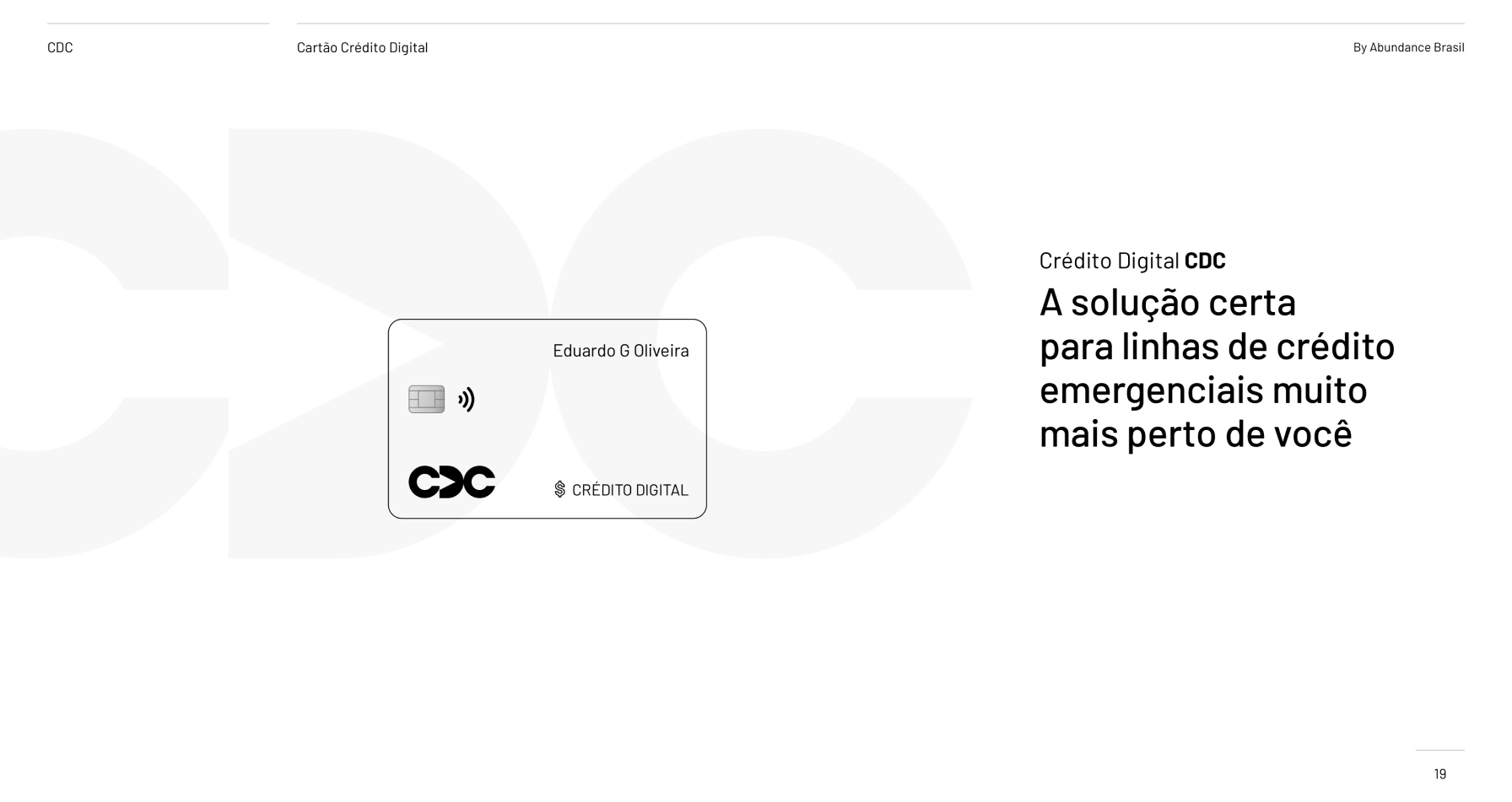
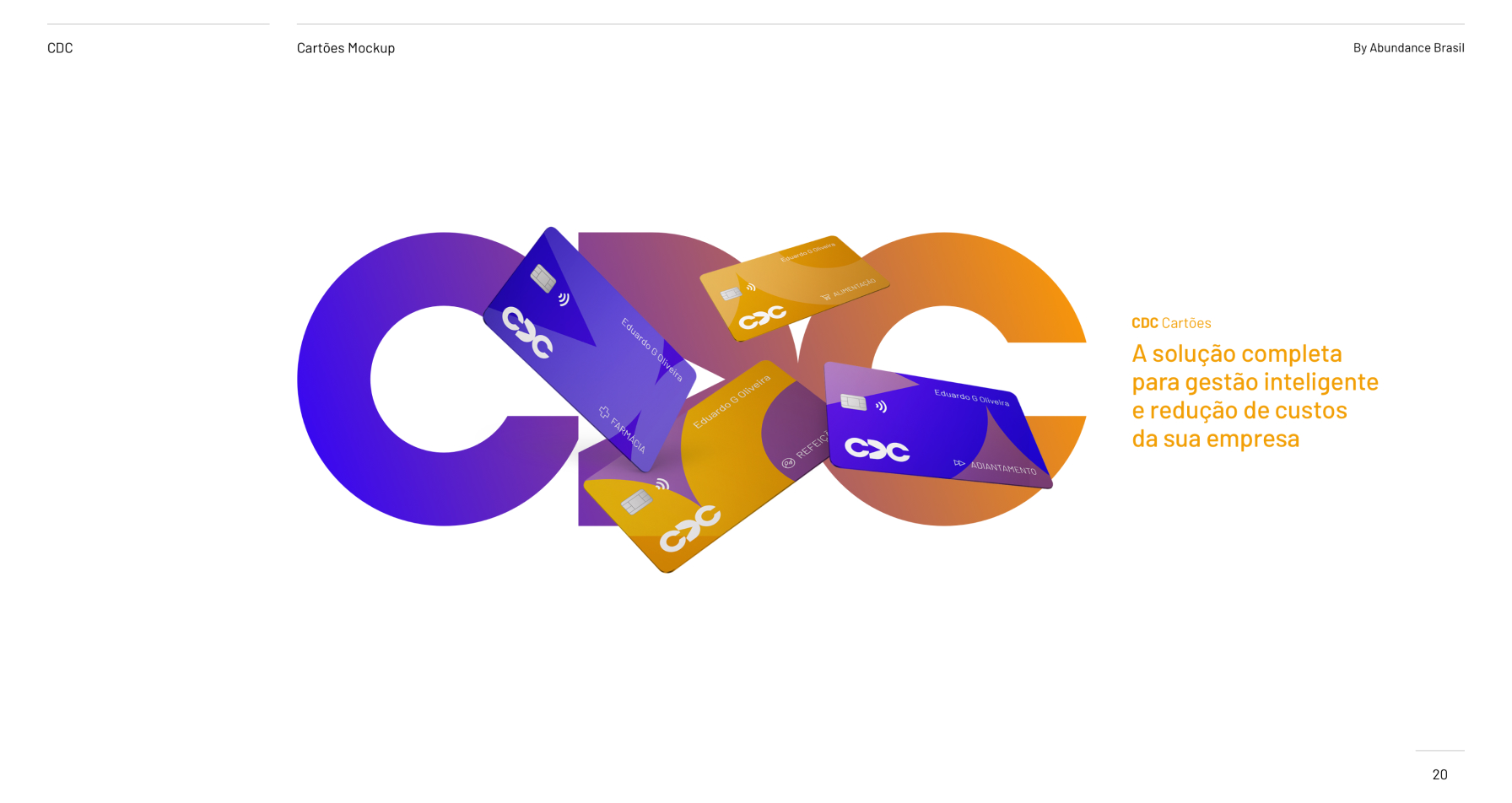
The redesigned logo featured a minimalist and versatile design that symbolized CDC’s commitment to simplicity, security, and seamless digital experiences. The logo incorporated a stylized arrow in the empty space between the first letter “C” and the letter “D”, representing the company’s forward-thinking approach and agility in adapting to changing customer needs. The typography was clean and modern, exuding professionalism and trust. The color palette included shades of blue and yellow, signifying stability, growth, and financial prosperity.

Results

The rebranding initiative rejuvenated CDC’s brand identity, positioning the company as a modern and customer-centric financial services provider. The refreshed logo and branding resonated with both existing customers and new prospects, driving increased engagement and loyalty. The cohesive and contemporary brand image helped CDC differentiate itself in the competitive market, attracting tech-savvy consumers seeking innovative financial solutions. Overall, the successful redesign reinforced CDC’s commitment to excellence and set the stage for continued growth and success in the ever-evolving financial services industry.