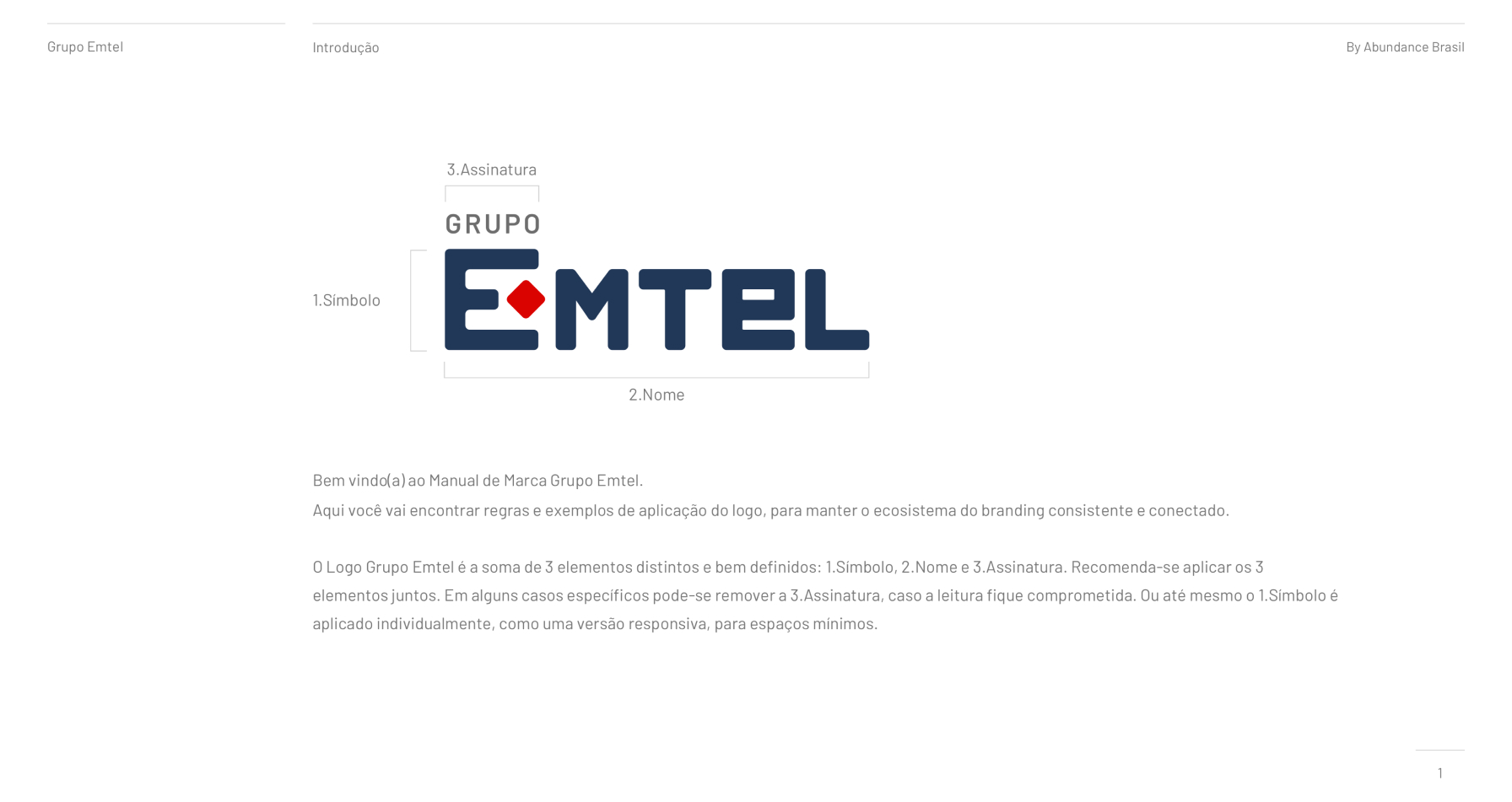
marcosloureiro1980@gmail.com

Brand Manual

Grupo Emtel_

Brand Manual, Logo/

2021

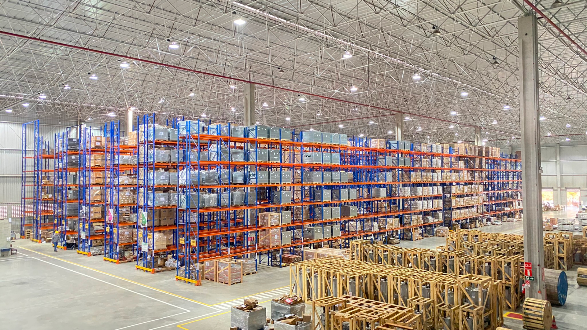
Grupo Emtel is a leading company operating in the transport, rental, and logistics market, with a diverse range of services including vehicle rental, logistics solutions, and transportation services. Despite its strong market presence, Grupo Emtel recognizes the need to revitalize its brand identity to reflect its modernity, innovation, and commitment to customer satisfaction.

Recent experience

Role

Brand Designer

Period

2/3 months

Tools

Photoshop
Sketch
Figma

Responsabilities

  1. Diverse service offerings: Grupo Emtel offered a wide range of services across the transport, rental, and logistics sectors, requiring a cohesive brand identity that effectively communicated its breadth of expertise.
  2. Outdated branding: The existing logo and branding felt outdated and failed to convey Grupo Emtel’s position as a leader in the industry.
  3. Competitive market: With increasing competition in the transport and logistics market, Grupo Emtel needed a refreshed brand identity to differentiate itself and attract new customers.

Approach

  1. Brand assessment: Conducted a comprehensive analysis of Grupo Emtel’s brand values, market positioning, and target audience to identify areas for improvement.
  2. Stakeholder engagement: Collaborated with key stakeholders, including management, employees, and customers, to gather insights and align on the objectives of the rebranding effort.
  3. Market research: Conducted market research to understand industry trends, competitor branding strategies, and customer preferences.
  4. Creative exploration: Brainstormed logo and branding concepts that captured Grupo Emtel’s core values of reliability, efficiency, and innovation.
  5. Design iterations: Developed multiple logo and branding prototypes, experimenting with typography, color palettes, and visual elements to create a cohesive and memorable brand identity.
  6. Feedback gathering: Presented the proposed designs to stakeholders for feedback and iterated based on their input, ensuring the final design resonated with Grupo Emtel’s vision and values.
  7. Refinement: Incorporated feedback to refine the chosen logo and branding elements, ensuring they effectively communicated Grupo Emtel’s unique value proposition and service offerings.
  8. Implementation plan: Developed a comprehensive rollout plan to implement the redesigned logo and branding across all touchpoints, including signage, marketing materials, and digital platforms.

Solution

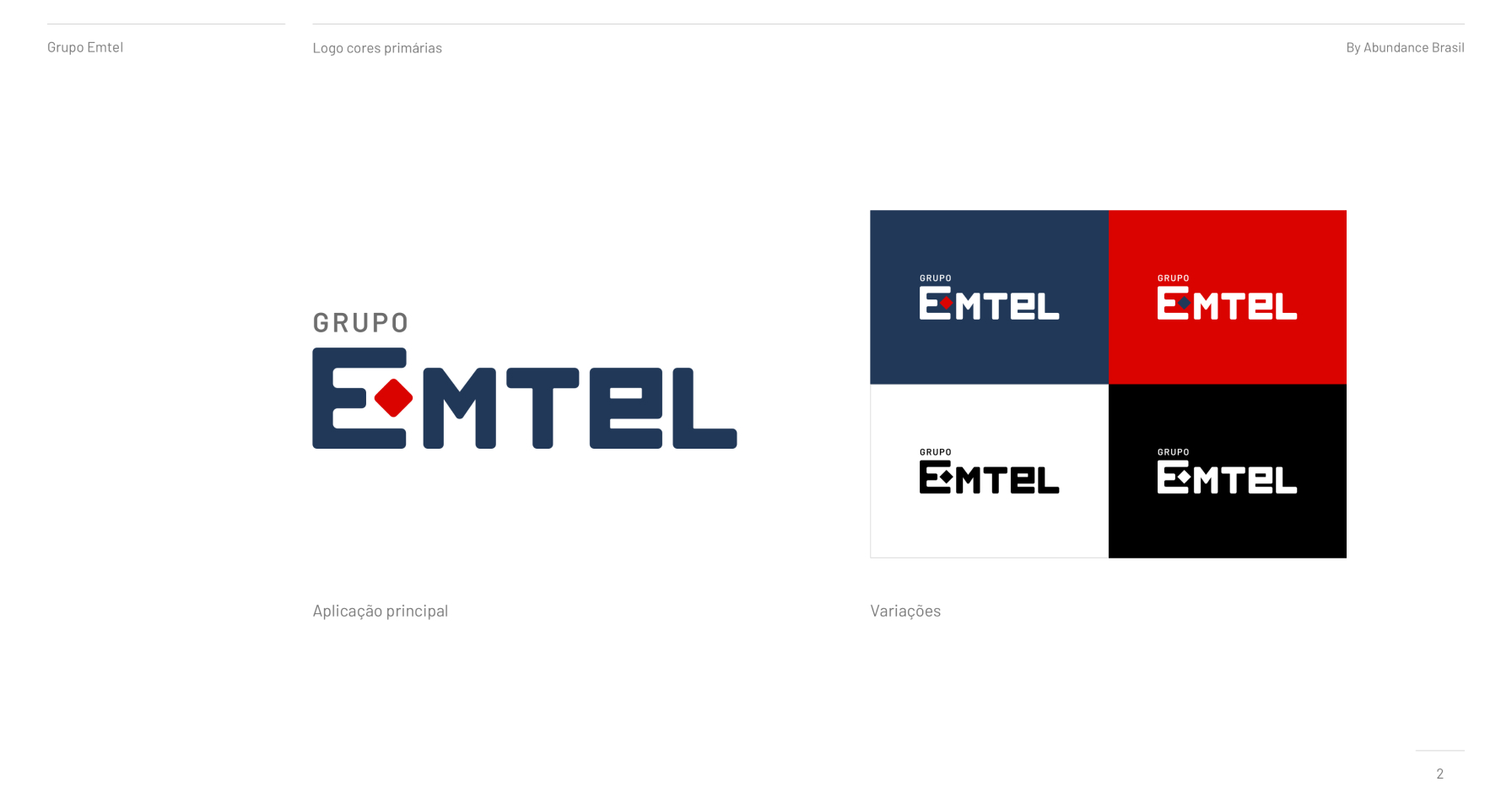
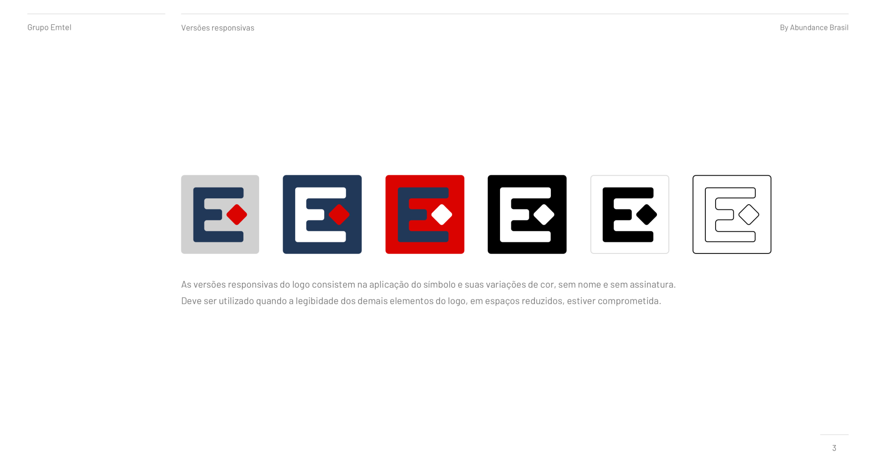
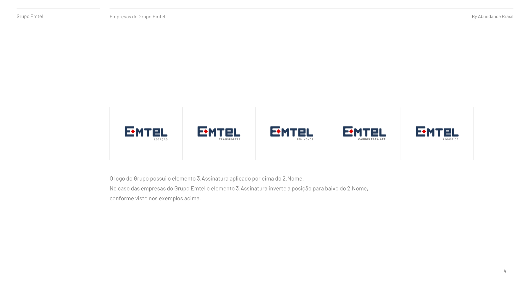
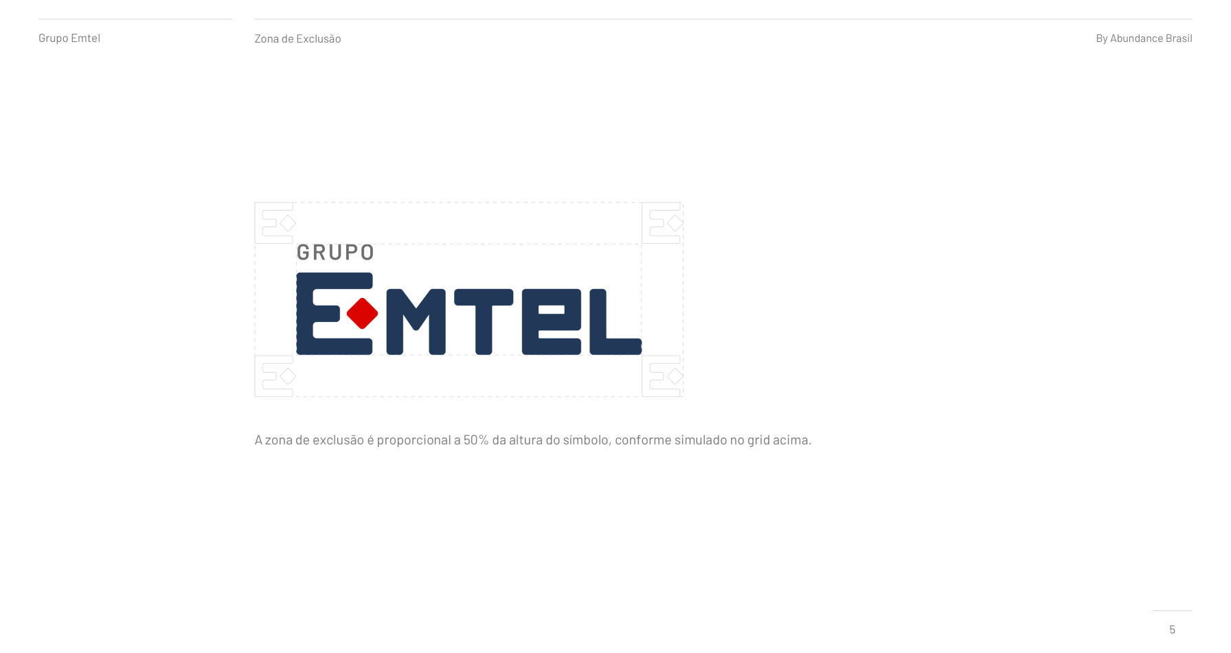
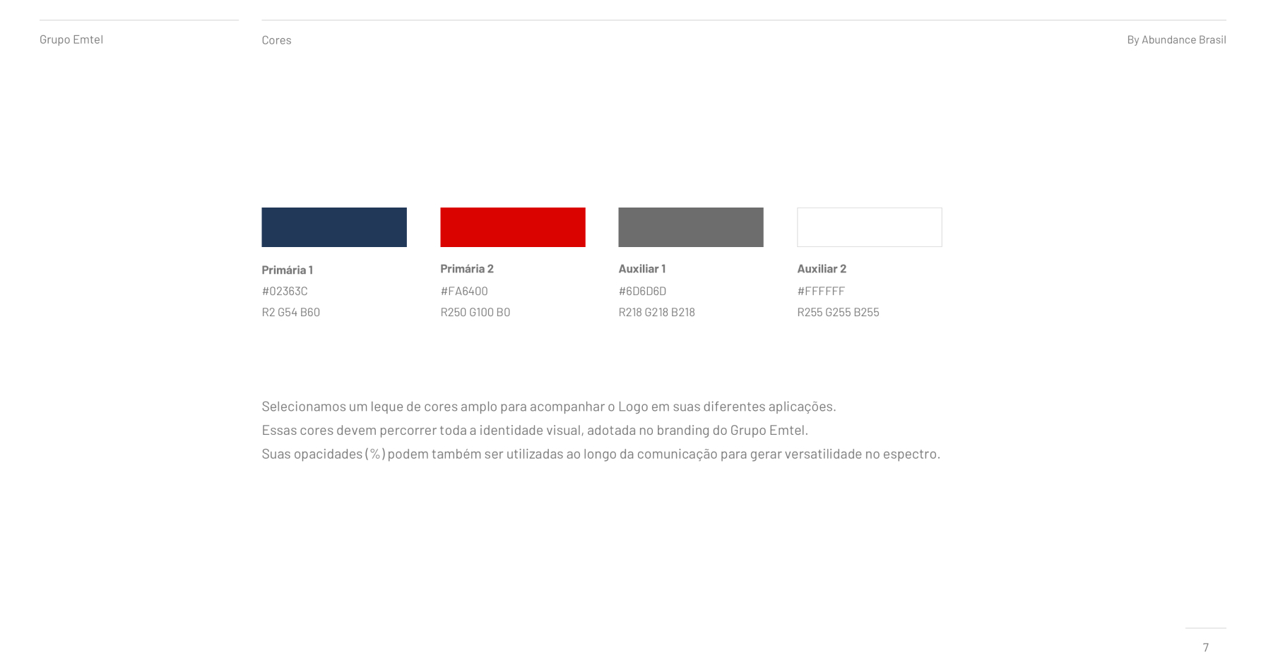
The redesigned logo featured a modern and dynamic design that symbolized the Emtel Group’s commitment to innovation, efficiency, and reliability. The logo incorporated graphic elements mixed with unique typography representing a delivery character, redesigned from the old version of the logo. The typography was elegant and contemporary, exuding professionalism and confidence. The color palette included strong shades of blue and red, reflecting stability and growth.

Results

The rebranding initiative revitalized Grupo Emtel’s brand identity, positioning the company as a forward-thinking and customer-centric leader in the transport, rental, and logistics market. The refreshed logo and branding resonated with both existing customers and new prospects, driving increased brand recognition and loyalty. The cohesive and modern brand image helped Grupo Emtel differentiate itself from competitors and attract new business opportunities. Overall, the successful redesign reinforced Grupo Emtel’s commitment to excellence and set the stage for continued growth and success in the competitive market.